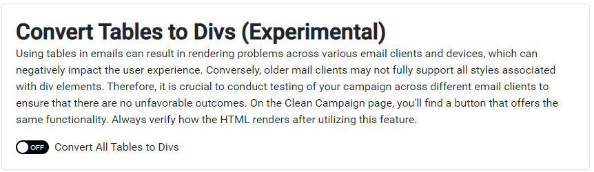
How does Tables to DIVS Conversion Improve Engagement?
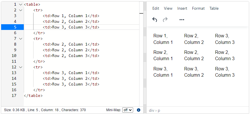
Example of Table to DIV Conversion
Before
After
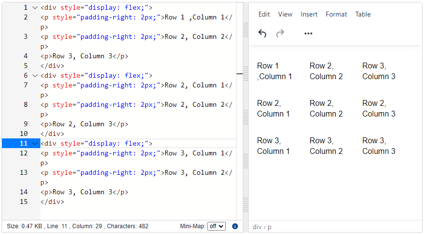
display to flex. Your results will vary, we recommend not using the feature as it is experimental. The more complicated the table structure, the less likely the conversion will yield the results you’re looking for.
Use Case to Replace Tables with Divs
Let’s say you’re sending a marketing email to your customers, and you want to include a product grid that shows a thumbnail image, product name, and price for each item. Traditionally, you might use a table to structure this content, with each row representing a product and each column representing the thumbnail, name, and price.However, some email clients may not render tables properly, resulting in a distorted or broken layout. Additionally, tables can be difficult to read on mobile devices, where screen real estate is limited.To solve these problems, you can use divs instead of tables to structure your product grid. Each product would be contained within a div element, with the thumbnail, name, and price each in their own nested divs.This approach ensures that your email will look consistent across all email clients, regardless of how they handle tables. It also makes the content more readable and responsive, particularly on mobile devices.By replacing tables with divs in your emails, you can improve the overall user experience and ensure that your message is communicated clearly and effectively to your audience.